ATS-friendly resume templates
Every gallery on the internet labels its templates ATS-friendly and none of them show you what comes out the other end. These eight publish the literal text a parser extracts from a real render, the score each earns on a rubric we publish in full, and how many pages the same resume runs to. Measured on .
What makes a resume ATS-friendly
An ATS-friendly resume is one whose text a parser recovers intact and in the right order. In practice that means five sections in a conventional order, real text rather than an image, and no container — text box, layout table, header band — holding content that has to be found.
- Contact details. Name, phone, email, city. First on the page and first out of the extraction, because a parser that cannot find these files the application under nothing.
- Summary. Optional, and skippable if it would only restate your job title. Two to four lines when it earns the room.
- Work experience. Reverse chronological. Each role with its own dates and its own bullets, so a title and its achievements extract adjacent to each other rather than as two separate lists.
- Education. Below experience once you have a couple of years of it, above while your degree is still the strongest credential.
- Skills. Plain text, grouped, comma-separated. Not rating bars — a graphic extracts as nothing at all.
The mechanism behind each of those, with the failures that produced them, is in what an ATS reads from your PDF.
The eight, with their measurements
Each card links to the full page for that template, where the extraction dump is printed in the order the parser produced it. One has a side column, marked below and explained on the page rather than left for you to discover.
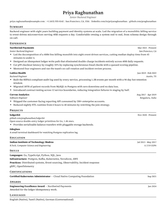
Classic
Source Serif 4 · Hand-written
Scores 89/100 · 2 pages at normal
See its extraction →
The default, and the one to pick when you have no opinion. A single column, conventional headings, a hairline under each section and nothing else — it is the layout every applicant tracking system has been calibrated against for twenty years, and its CSS is the stylesheet our entire render pipeline was proven with. Recruiters in banking, law, consulting and government read hundreds of these a week, which is exactly why yours will not be the one that stalls in a parser.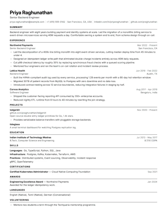
Modern
Inter · Hand-written
Scores 89/100 · 2 pages at normal
See its extraction →
Classic's structure set in a compact sans instead of a serif, which fits noticeably more on a page without shrinking the type below what the scorer will accept. It is the engineering default here: it suits software, product and analytics roles, and it is the one to pick when you have more to say than fits comfortably and do not want to lose the second half of a job to a page break.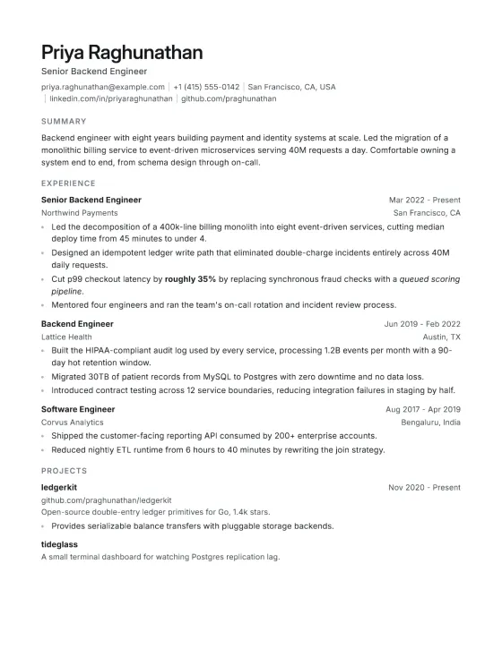
Minimal
Inter · Stacked
Scores 92/100 · 2 pages at normal
See its extraction →
For people whose content is strong enough to carry the page alone. There is no rule under the headings, no accent colour and no ornament — just a tight grid and a lot of white. It photographs well as a PDF attachment, prints cleanly on any office printer, and it is the safest choice for academic and research applications, where anything decorative reads as unserious.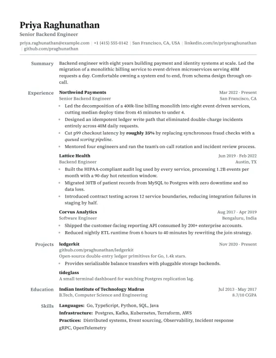
Executive
Source Serif 4 · Hanging
Scores 89/100 · 2 pages at normal
See its extraction →
Section labels hang in a left column and the content sits beside them, in a serif, which is a layout that reads senior before a word of it is read. It suits directors, senior individual contributors and anyone whose employer names are themselves the argument — the hanging labels keep the eye on the organisations rather than on the structure of the document.
Column
Lato · Hanging
Scores 89/100 · 2 pages at normal
See its extraction →
A label column down the left holds each section's name while the content sits beside it, which buys a lot of air without buying a second column of content. It suits someone with a short history — one or two roles, a degree, a few projects — because the layout reads as considered rather than as a page with gaps in it, and designers tend to like it for the same reason.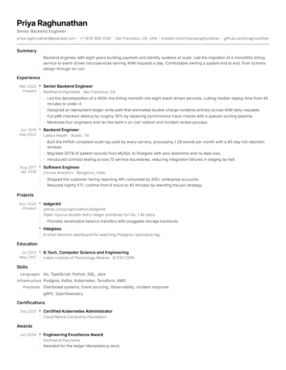
Timeline
Inter · Hand-written
Scores 89/100 · 2 pages at normal
See its extraction →
Dates sit in a left gutter, so the shape of a career is visible before a word of it is read. It suits a long, continuous history — someone who has stayed at two or three companies for years, or a manager whose progression is the point — and it is one of the three templates whose CSS is hand-written and was proven directly against the render spike.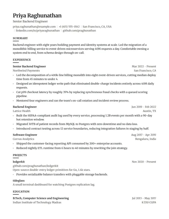
Editorial
Merriweather · Stacked
Scores 92/100 · 2 pages at normal
See its extraction →
A magazine serif — Merriweather — with generous leading, which gives the page the rhythm of print rather than of a form. Its headings are set at deliberately tight tracking, because bold uppercase Merriweather split into one run per character at the tracking this style usually invites, and a heading that extracts one letter at a time is a heading no parser will ever match. It suits writers, editors, marketers, academics and anyone whose work is language.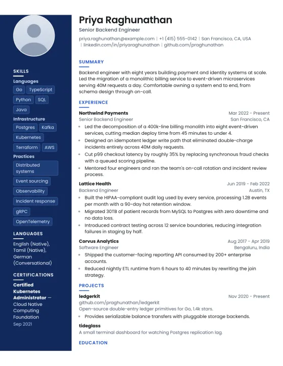
Azure
Poppins · Rail · side column
Scores 92/100 · 2 pages at normal
See its extraction →
The one genuine two-column layout in this set: a deep blue rail carries your photo, contact details and skills as pills, leaving the main flow for experience. Because the rail is emitted last in the markup and placed into the left column by grid, the extracted text still begins with your name and summary rather than a skills list — which is not true of most two-column templates on the market. It suits creative, design and customer-facing roles, and it is the only one here built around a portrait.Questions
- What makes a resume template ATS-friendly?
- Real text rather than an image, a single main flow of content, standard section headings, a font whose characters survive extraction, and no text boxes or layout tables holding your contact details. The reliable test is not the template's label: open the finished PDF, select all, copy, and read what pastes out.
- Are two-column resume templates ATS-friendly?
- Mostly yes. A side column does not lose your text, but a PDF extracts page by page, so on a two-page resume the column's content lands after whatever fitted on page one. Templates here that have a side column say so, and the order within each page is still Summary, Experience, Education.
- Do ATS-friendly templates need to be plain black and white?
- No. Colour, rules and accents are not read by a parser at all — they are ignored along with every other visual property. What breaks extraction is structural: text boxes, layout tables, images of text, and bullet markers built from positioned decorations rather than real list markers.
- Will an ATS-friendly template get me past the filter?
- It removes a way to fail, which is not the same as a way to succeed. Parsing is close to pass-or-fail and a good template makes it a pass; after that the decision is your experience and how it is written. Every template here passes the same automated extraction test, so choosing between them is a question of how you want the page to look.